The Art Department website is very bland and in the same style as the rest of the SOU website.
The first page of the website offers an image of the university with a cut out border but is unoriginal visually. The Art Department website should feature more use of color and dramatic imagery.
On the Facilities page, there should be student art work shown for each different facility along with pictures of the different facilities. The facilities should also be separated more to help create more of a flow rather than how cramped it looks visually now.
Overall, the Art Department needs more visual impact. After all, this is the website for the ART Department. It should feature the strengths of every aspect in the art department and show student work to help encourage students to attend.
Friday, March 20, 2009
Sea Maiden

Red hair
Black hair
Greenish gold paint by the chin
Turquoise eyeshadow
Stars in the background and overlain in the image
Greenish blue paint on hand
This photo is called "sea maiden," since most of the colors are green and blue in tones. The red hair helps add dramatic impact and flare to the image. The use of color in this image help to mimic the sea except for the red. However, one could say that the red color does also help mimic the sea by paralleling it to red coral. The stars in the background help to give this photo an otherworldly, goddess feel. Overall, this image is fascinating since it incorporates reality, the woman, with fantasy, the stars and wild makeup.
Innocence with a Tinge of Surprise
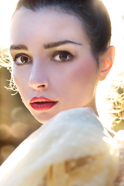
Woman
Dark brown eyes
Red lips
White lacy shawl
Sunlight
Blurred, dry, nature background
I chose to comment on this image specifically because of the expression on the young woman's face. Her expression resembles that of innocence and of surprise, paralleling that of a deer's expression probably because her expression is similar to a deer in the headlights or just of one caught off guard. Because the eyes are said to be the windows to the soul, the woman's eyes express to the viewer innocence and surprise. The sunlight behind her frames her and helps her to stand out. Her red lips somehow seem to enhance her expression. The white shawl helps further emphasize innocence in this photo.
Monday, March 16, 2009
Y Tu Mamá También

One Woman
One man in front of her
One man behind her
Text
Green title text
Red names for the actors
Red behind woman
Palm fronds in front of the man and woman
First, a description of the cover (so this can be used as a visual critique). This movie poster exudes sensuality and sexuality with its use of color and imagery. The two men are both holding one woman. The woman has red behind her, symbolizing passion. The palm frond on the left hand side helps to symbolize paradise and vacation.
I chose to review this movie for the Ashland Film Festival assignment since all the Ashland films had been taken down at DJ's Video and so I was allowed to choose a foreign film. This movie was very different than a lot of movies I have seen. The movie was rated 18 and over. I had heard about this movie several times over the past couple of years and decided it was time to see it. This movie was very sensual and erotic. This movie is about 2 young boys, around 18, who are around the age of graduating high school. Their girlfriends decide to travel to Europe and go to Italy one summer. While they're gone, they meet Luisa, who is married to the cousin of one of the boys. Basically, the boys convince Luisa to join them on a road trip to a beach. She at first protests because she is married but decides to go with them after she has a dramatic event happen to her. To mask her pain, Luisa has sexual relations with both boys. The boys develop friction within their friendship because they both discover that they have broken their guy's "code" of friendship they had developed together. Both boys not only slept with Luisa but had slept with each other's girlfriends in the past. This movie shows that while on the surface friendship may appear stable and fun, with some friends there is a murkiness just beneath the surface that can end up destroying a friendship. This movie also shows how a woman in pain (because of several circumstances) used sex as a way to numb herself against worldly pain.
Tuesday, March 10, 2009


Friday, March 6, 2009
Soul Reflection

1 blurred figure with reflection in a mirror
In focus striped walls with tan and off white strips
This photo is titled "Soul Reflection" by Elif [Sanem] Karakoç on DeviantART. I find this photo fascinating. The nontraditional effect of blurring the subject is very useful and impactful here. The use of the mirror further helps convey the artist's message as well as the striped walls remaining in focus. The striped walls help to depict the individual in the world, viewing herself. I believe the title "Soul Reflection" refers to the idea that it is challenging for individuals to truly view themselves. The literal translation of this could be simply viewing ourselves in a mirror, but in reality, this pertains to viewing our lives as a whole, our personality, and good attributes. In essence, it is hard for individuals to truly see and view our SOULS.
Tuesday, March 3, 2009
Revised Content Assignment
 I noticed that some of the bigger fonts were messed up on my original so I fixed these and wanted to print a better version.
Monday, March 2, 2009
Split Toning

Bluish black and white tone
Sharp eyes and lips
Soft face
Pearl necklace
Because Warren commented on one of my visual critiques about split toning an image, I decided to randomly try it out on some photos I did with a friend recently. My friend is applying to photography school, and I am a serious photographer. I did not like the original image as a whole but only some key elements. I knew I could make it look spectacular by tweaking it a bit. I did not like the way the picture was framed so I cropped it. My friend and I have two different philosophies. I crop in the camera, meaning I essentially crop when I'm taking the picture so that what I shoot is the final image in reference to cropping. My friend likes to crop more after so she has more information and creative choices available. Neither way is incorrect, just different opinions.
Anyways, I also used gaussian blur with an opacity of around 50%, I think, erased the blur from the eyes and lips, and the spot healing brush tool. I also used the dodge tool to brighten the catch lights in the eyes, the little white windows in the iris of the eye. Warren had commented on turning an image into black and white using an adjustment layer and then doing a color balance layer and adjusting, in the shadows, the blue and in the highlights, the yellow. I did this and liked the effect with this image. The reason this works is because these colors are complements of one another on the color wheel. Because of this, I reasoned that the same thing would work with increasing red in the shadows and cyan in the highlights. The above image was the result.Below is the original image:

Saturday, February 28, 2009
White Fishnets
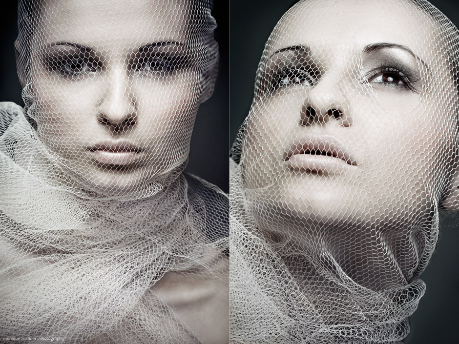
Brown eyes
Up close model
White netting
I chose to comment on these portraits because they're so unique. The netting adds a very different flair to them. It looks like she's wearing fish nets on her face. I find it interesting that it seems weird to me for her to be wearing fish netting around her face. This is because it is normal to wear fishnets on your legs and sometimes arms but not on your face. I guess I'm just questioning the concept of clothing. We wear clothes on our body but almost never on our face. In regards to both photograph, the one on the right looks stronger and has a penetrating gaze. On the left, the photo is more feminine, and her eyes are looking to the side.
Golden Landscape

Warm tones
Golden green grass
Sunset on the left hand side
Rock formation
Dark clouds
I found this image at deviantART under digital art. I think it is beautiful and seems like it would have taken a long time to create. The warm tones indicate a summer vibe and also a sense of a summer night. I can just feel how it would be to be sitting in that field with a warm but slightly cool breeze while the sun sets. Overall, this picture is just beautiful.
Tuesday, February 24, 2009
Contents
 This was the first time I used the program, InDesign. It worked fairly well. It took some getting used to, although some of the functions were not intuitive. For example, I was looking for an "Import" button to import an image but instead had to use Place, something I never would have thought. Overall, this was a good experience particular since I may work in graphic design in the future. The aligning text features worked very well. Also, paragraph styles allowed me to change text styles quickly.
Tuesday, February 17, 2009
Adobe Bridge Websites
I am shocked that I can now create beautiful websites quickly that look very professional in a short amount of time. Because of this, I can spend more time organizing the images and creating separate categories. I can even put titles for all of the images. In general, the way Flash looks really does wonders for a website.
Rapunzel

Open window
Torn papers
Broken window shutter
Girl slumped against window with head in her hands
White wedding dress
I found this image on deviantART. This photo was titled "Rapunzel." The headline for this photo reads:
"she believed and held on
to everything that was once promised,
everything that would be,
fading away..."
The photographer is doing a series of portraits that deals with fairy tale concepts.
I find it ironic that this photo is called "Rapunzel." The quote, in regards to the image, alludes to the idea that this young woman appears to have been left at the altar. She somehow ended up in an abandoned, rundown area, and proceeds to let her hair down and succumb to sadness.
I absolutely love the composition and tones of this image. This image is desaturated in color and emphasizes the mood of the image. The woman's dress is snagged on the wall, and the woman appears forlorn. In the tragedy of this woman's circumstance, it is possible to find a melancholic beauty.
Yay for Spanish Visual Critiques!
 The words: "De que color es el amor?"
A white paper heart
A hand holding the heart
Sepia toned
Ok, first of all, I am so glad I *FINALLY* remembered the website where I found this image. The website is called deviantART, and it is one of my all time favorite websites to look at. This website features photography and art and has some incredible work.
Anyways, back to what I was originally focusing on...
This photo includes the words, "De que color es el amor?" which translates to "What color is love?". I This photo is so simple in composition and color choice. It is sepia toned and therefore monochromatic. I like the contrast between the words "What color is love?" and the fact that the image is sepia toned. I find the handwriting very unique. The words "De" (of) and "Que" (what) are both capitalized but the following words are all in caps. I think this emphasizes the color the artist chose for the image. In our society, red is associated with love; this is why this image appears ironic but visually stimulating.
Saturday, February 14, 2009
Amor (Love)

Guy in blue shirt
Girl in pink dress with red bra
Kissing
Golden, dry landscape in the country
Lens flare by the guy's hand (?)
I felt this was appropriate for Valentine's Day. The golden tones in the background complement the couple in the foreground. The most colorful parts of the image are the two individuals. What is so appealing about this picture is the connection between the two people. People want and crave for this kind of connection and love, which is why this image is so popular. This couple is emphasized even more with the sunlight illuminating their hair. The red tones in the girl's attire symbolize passion and love, as well as femininity with the pink dress, while the boy alludes to the masculine counterpart by wearing blue.
He's Just Not That Into You

Words: He's just not that into you, actors names, etc.
Call me valentine candy
Girl smiling and talking on her cell phone, looking to the right
Blond guy smiling and looking left (on the right hand side)
Scarlett Johansson (blond girl) smiling and looking left, with her hand on her chest
Ben Affleck (dark haired guy) smiling, looking left, with ocean behind him
Dark haired guy wearing black t-shirt that is unbuttoned (on the right hand side) smiling, looking left
Jennifer Connelly (dark haired girl) looking right with a slight smile
Dark haired guy (at the top) looking somewhat surprised
(Top left) Jennifer Aniston (blond haired girl) smiling, looking to the right, in a peach dress
(Top right) Drew Barrymore (dark haired girl) smiling, looking to the left
I saw this movie yesterday and found it good but fairly depressing. This movie brutally showed the mistakes people make in relationships. It was honestly hard to watch and heart wrenching. While this movie is good, I do not intend on seeing it ever again. What makes this movie an emotional roller coaster is the mistakes the characters make are mistakes everyone has made at some point or another but seem to be put on a larger scale.
The type that the words are in is symbolic. The word, not, is emphasized since it is in italics, showing what the theme of the movie itself is.
The fact that almost all the characters are smiling is very deceiving. When I first saw this movie, I did not expect a huge amount of intensity as I received. I am wondering if, subconsciously, the fact that all the characters are smiling signaled to me that while there would be some drama in this movie, it would be more funny and uplifting. While it is true that the movie's title clearly states what it is about, I feel that the poster is misleading. Perhaps this is also because I am a part of American society. We want happiness, love, and the ideal so much that we prefer to perceive things, like movies, to be uplifting and light, even when the obvious is stated.
The candy positioned by the girl talking on the phone is very appropriate and symbolic. In this movie, this character, Gigi, is constantly misreading men and waiting for men to call her that never do.
I wanted to make an observation about the characters that are looking to the right. In the movie, I personally felt that the characters, who are looking to the right in this picture, had the most complicated relationship issues. For example, with Jennifer Aniston's character, she had been dating a man for 7 years who did not want to get married, simply because he did not believe in marriage. Jennifer Connelly's character was suspicious of her husband smoking, which mattered to her because her dad died of lung cancer, but did not know that her husband, the man with the blond hair, was having an affair with Scarlett Johansson's character. The girl talking on the phone, at the bottom of the poster, also had major relationship issues since she was unable to find a good man to date period. She kept making heart wrenching mistakes with men.
Tuesday, February 10, 2009
Poster(s)

This process has been a lot different than what I would usually do. With the above image, I took 3 separate images and tweaked them all. I used free transform frequently to incorporate diagonals and also messed with the hue and saturation. I also used a technique which uses the blending mode, overlay, to apply a specific yellowish tint to the cigarettes. I used the quick selection tool select the smoke.
I also began to learn about Illustrator and the neat effects one can do with an image. I was shocked that certain features of Illustrator were so easy to use such as the Live Trace and custom options. It made it look like an illustration with just a couple of clicks of the mouse.

I tried to do several more posters but could not get things to flow. I would try different images but could not get anything cohesive or honestly as visually interesting as this. This was pretty frustrating since I wanted to try to make at least 2 posters. One idea I had thought about was Valentine's Day. I wanted to incorporate chocolate, hearts, and the word, love. With the hearts in this poster, I used the shades of brown located in the chocolate. I also processed the chocolate in Illustrator using 6 bit color.
Friday, February 6, 2009
Marilyn Monroe

Black and white
Simple grey background
Interesting dress top
Smiling
Looking away
I chose to comment on this Marilyn Monroe photo because although it is beautiful, to me it looks like she could be someone I know in real life. Most of Monroe's photos have that ethereal, glamour air that people view as something they can never look like. Monroe has longer hair in this photo than in most and seems very innocent and young. This photo reminds me of a young high school girl and literally looks very similar to a specific person I knew in high school. The spotlight draws the eye to Monroe's smile and eyes. This photo is a classic example of the looking away pose, used frequently in many portraits even today.
Michael Phelp's Infamous Photo

Michael Phelps
Blue hat
White t-shirt
Pipe
News of the World
Blue Cup
This picture is pretty shocking. Michael Phelps, who just won many gold medals at the Olympics, was recently caught smoking a pipe as shown above. Phelps has been suspended by USA Swimming for 3 months. This just shows what one picture can do. Phelps is a hero and role model for swimmers across the US and even children. By participating in drugs, he is setting a bad example. However, I have to admit, Phelps is 23. I am sure 23 year olds still want to be able to experiment and have fun without getting penalized by the media. I do not believe Phelps meant harm but was trying to blow off steam and someone happened to have a digital camera. This just shows how little privacy we have anymore.
In terms of composition, my eye is drawn to the orange pipe and then, oddly enough, to his watch. I almost find a metaphor in this. As the eye travels from the pipe to the watch, it could signify pipe smoking was a waste of time or perhaps a pivotal mistake for that one moment in time.
Collage

This is my collage. Miles Inada helped me to break out of the traditional collage format and try something more innovative and odd. My finished product is not what I typically visualize a collage as, but Miles taught me to think outside the box.
Saturday, January 31, 2009
Picturing the "Other"
 This is the first image I took for this assignment. I found this assignment fairly challenging. I am usually a pretty outgoing person who likes to meet different people, yet I had a hard time with this assignment. Therefore, I first began taking photographs of people from a distance, like the girl on the left. She was vastly different from me in age and perhaps ethnicity. I wanted to show the fairy tale, wondrous side of childhood and capture a certain magical spark.
 This photograph shows the relationship between father and daughter. However, it also illustrates a different dynamic that, at first, I did not realize. The father is Caucasian and the daughter is Mexican. I discovered this when I watched two families enjoying the park, both of which included Mexican ethnicity's and realized that the father of one was Caucasian. I did not realize this before because the importance, for me, was on the relationship between the father and daughter, not what skin color either had. I chose to photograph this relationship because I have definitely not yet experienced a relationship with my own kid. In general, I had wanted to go up to the families and ask to take a photograph, but I was honestly too shy at first and didn't get the chance. Once I was brave enough, the families were already leaving. I wanted to take a photograph of these families because I feel a sort of connection and kinship to the Hispanic culture (as you can tell by reading my blog).
This young woman is the first person I asked if I could take a photograph of. I knew that once I began asking people, it would be much easier. She seemed sweet and was with her husband/boyfriend?, walking her mother's poodle. Originally, I was going to take a photo of her husband but was delayed by a phone call. I saw how the light was hitting her and realized it would be a good picture, so I got out of my car, where I had been waiting to find someone to take a photo of (I had already been out in the freezing cold looking for subjects so I had decided to stay in the car for a while) and ask her if it would be ok to photograph her. She was very friendly and sweet. I took this picture to show the relationship and love between a girl and her dog.

This other photograph has a different emphasis. I placed emphasis on the girl the most, trying to show her beauty and the way the sunlight was illuminating her hair. This photo is more about the girl than the girl with a dog. I used Photoshop to smooth out her skin, a technique I tend to use for most portraits to make them look more glamorous.
 To help me gather courage, this is one of the first pictures I took of the second subject I asked. At first, I was shy and so I took a photo far away; therefore, I did not feel like I needed to ask permission. I felt drawn to this particular man because of the way the light was hitting him and the serenity he seemed to radiate while reading in the park.
 As you can see, I was gradually getting up the nerve to ask this man if I could photograph him. He seemed nice, a different gender (so fitting the description of the "other" according to our assignment), and my intuition told me that he would be good to photograph. I was already a lot braver since I asked that one woman if I could take her picture. It was kind of exhilarating. Therefore, after this picture, I finally asked this young man if it would be ok to take some photographs.
  I finally got the nerve to ask him if I could take his picture, and he was very nice and said that would be fine. After taking this picture, I asked him what book he was reading, and it sounded fascinating although I can't recall the title right now. We then started talking about cameras, and he actually had heard of my camera, the Pentax K10D. I was impressed. It was refreshing to meet someone who knew about photography and cameras, since I have a strong passion for both.
  I took this photo as we continued talking. After taking photos of him, he gave me his email so that I can send the photos to him, and he can send me the name of the book he was reading. He had mentioned that he had traveled a lot and that he read this one book every couple of years because of that. Overall, this was a very exciting and good experience. My intuition led me to meet someone like minded and kind.
 On a side note, I could not decide if I liked this photograph more in black and white or color, so here are both.
 I discovered something interesting in the way I approached Photoshopping images of this individual. Typically, I smooth out imperfections, but for some reason, I did not want to smooth his skin because the lines added character.
I had only one person decline to be photographed, but he was very polite and even mentioned that I did not have to ask but thanked me for being courteous. I already knew that you technically do not have to ask someone to photograph them, but I wanted to be nice.
I also realized another important aspect about myself in this process. I still love photography, portraits, and people in general. I found out that it was not as hard as I thought, and also I realized it was easier for me to approach people because I have a likable personality. It is in my nature to be friendly and outgoing. Also, I love to meet people and communicate.
Tuesday, January 27, 2009
This is My Guanajuato

Buildings of all differrent colors
European architecture
Mountains
Sky
Trees
Ahh....mi amor (my love)! This is Guanajuato. This is the place I spent my summer, grew in more ways than I can ever possibly describe, and where I want to eventually go back to with one of my best friends and her boyfriend. Most people romanticize their experiences in other countries and neglect to mention that everything was not always all roses and happiness. While I had my share of trials and tribulations, I feel ready to take on much more in my life now and would not trade my experiences for the world.
Now back from my tangent, I will seek to analyze this photograph. This shows the incredible amount of houses and colors in Gto (Guanajuato). I literally find this images gives off the vibe of a sea of houses nestled inside green cascading hills. I feel like the sky does draw your eye to it since it is so bright, but the buildings draw your eye the most because of their increased saturation. Absolutely breathtaking, this photograph uplifts my spirits as well as my heart.
Visual Critique I: Week 4

Blur
Yellow
Green
Brown
White
Light Purple
Light Blue
I have chosen to comment on this image because it is an unusual photograph. I took this photograph in Lithia Park for fun when I was experimenting with blur. This photo seems to have a low contrast hue since the colors appear to blend together (not just literally ;) ). I enjoy this photo since it gives the illusion of waves, especially the way the camera was panned (moved) when I took this photo.
Saturday, January 24, 2009
Visual Critique II: Week 3
Hands cupping water
Reflection of a palace in the water
Lake
Reeds
Dark, smeared border with a painterly effect
This photograph is absolutely amazing. It effectively uses simplicity while incorporating Photoshop to add fantasy, creating an image that is visually appealing and beautiful. The dark border helps the viewer draw himself into the image and also mimics the water in the scene. Overall, I found this photograph a wonderful use of reality with manipulation.
Visual Critique I: Week 3

Girl on carousel horse
Blue flower mandala that appears to also be part of a tower in background
Bright color
Snow covered trees
Snow covered mountains
Water
This image has an excellent use of color and curved lines that add to create a magical, fairy tale scene. Essentially, this image uses lots of images from childhood fantasies. For example, the carousel is not an ordinary carousel but is extravagant with lots of brilliant lights. There is a tree present on the right hand side that has Christmas lights on it, adding to the feel of magic and childhood. The one thing that is a puzzle to me is the mandala-like flower. I know about mandalas because one of my friends is a mandala artist. I think this flower was added to the image to create further peace and wonder to the image. Perhaps the young girl is looking at the flower in order to get some kind of spiritual awakening or trying to discover who she is.
Visual Critique II: Week 2
 Humpback whale
Snowy mountains
People holding tarp of the ocean
Ocean floor
Sky with clouds
This picture is fascinating. I believe the significance of it is that oceans and ocean life, such as whales, are under human control to an extent. Humans can choose whether to pollute ocean waters or help save animals within them. The humans are holding a tarp because they can choose to save the humpback whale and protect it in its environment.
Tuesday, January 20, 2009
Visual Critique I: Week 2

Labrador puppy
Red Bow
Text
I recently saw this movie quite unexpectedly. One of my best friends, Kate, and her boyfriend, Carlos, invited me to see this movie on Sunday night. Kate and I both had lots of homework to complete but (as usual) did not really want to do it. Of course, since I had been doing Spanish which seems like a never-ending pile of homework, I jumped at the chance to get out of the house and see this movie. Originally, I did not really want to see this movie, although it is based on a true story. I knew about the ending, and do not like to watch sad movies. I ended up enjoying the movie, particularly the beginning, but will not watch it again. The ending was heart-wrenching. Everyone in the theatre cried. The poster is simple and yet somewhat deceiving. One sees a cute, little puppy and automatically assume it's going to be fun and light, throughout the entire movie. While there were parts that were comedic and light, the movie had such an intense and serious ending that my friends and I had to watch a comedy after seeing this movie, the movie "Step-Brothers."


Sunday, January 18, 2009
Visual Critique II: Week 1

Sunset
Palm trees
Tropical landscape
Sunset
Girl in skirt
Balloons
Words
I enjoy how this picture seems almost contradictory with the quote that is on it. The girl appears to be rather light in subject matter and mood, although she is in shadow. The balloons help add to this light mood. However, the quote shows a deeper meaning, "Sometimes the hardest thing and the right thing are the same." The artist appeared to do this for some irony, but I also question whether it is also because of a certain energy attached to the picture. Perhaps the artist wanted to show that although the hard thing and right thing are the same, making this distinction and acting on it will eventually lead to a feeling of lightness and FREEDOM. There's a feeling of freedom to the girl with the balloons, with the sunset. She seems to almost be whimsical, without a care. I believe this piece has a certain serenity about it that allows the viewer to understand the quote and draw further conclusions about what happens when one makes right yet hard choices in life. Eventually, freedom and peace will come.
Subscribe to:
Posts (Atom)
